The Lighting of INSIDE
by Marek Bogdan, 2016
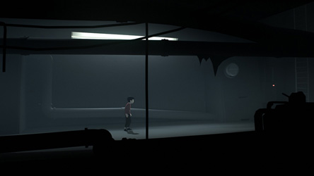
As you might have heard, INSIDE was made using a pretty heavily-modified Unity engine. One of the most intensely worked on areas was rendering, and I think that looking at the game, this is quite obvious.
What might not be so obvious is that, rather than using an ‘automated’ lighting solution, our team opted for a set of tools that relied on manual placement of the various effects that simulate realistic lighting, including: bounced light, specular light, rim light, AO and even the good old cast shadow decals.
In other words: the lighting you see in INSIDE is all about layers of hand-placed decals – there is no global illumination or even automated AO at play here.
One reason for this was that the style required a painterly look that felt as close as possible to Morten’s concepts. Another was that modeling (and lighting) detail had to be controlled very precisely depending on distance from the camera and gameplay or narrative focus. Of course, this being a side-scroller had a lot to do with the decision as well – knowing precisely where the camera was at any given time allowed us to tweak the effects with as much precision and subtlety as we liked.
Here are some examples of this ‘targeted high fidelity lighting’ in scenes I worked on:
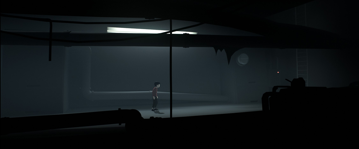
A little corridor leading up to the Cargo Hall area. Bounce light, subtle specular on the pipes and ambient occlusion effects are all accomplished using hand-placed decals. In scenes like this, I believe that being very diligent about having every available effect support the lighting setup is very important. Note for example how the cube map reflection on the glass energy meter (round cylinder on the upper right) is accurately simulating where the bright area is. Extremely subtle but again: these things add up and they do matter.
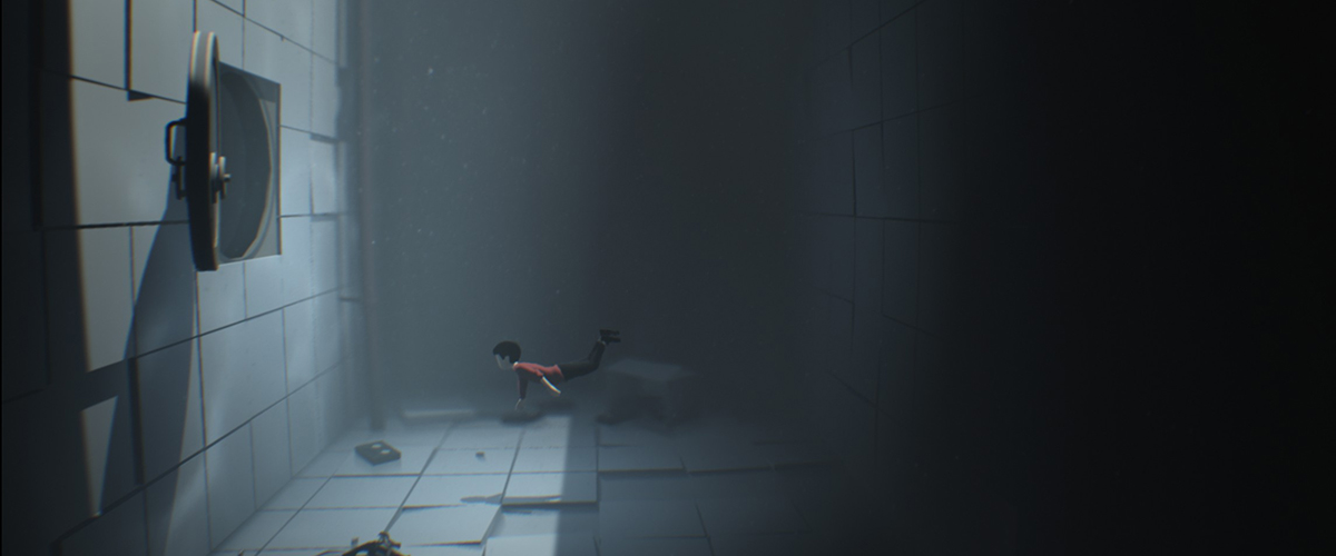
Another extremely simple room that owes everything to detailed lighting.
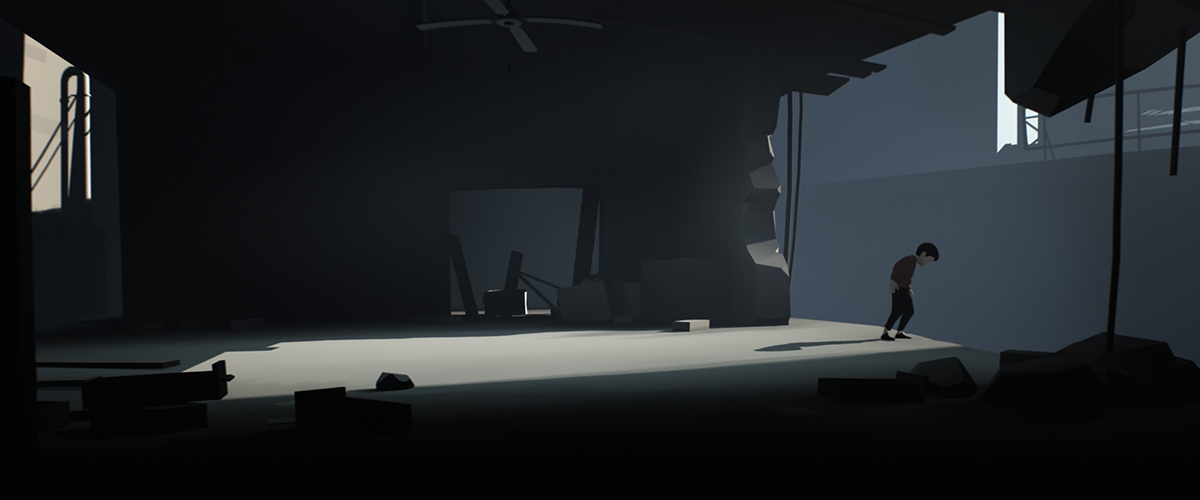
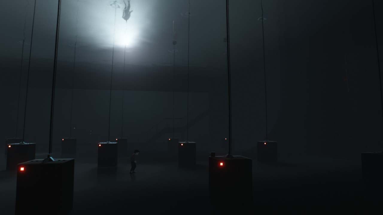
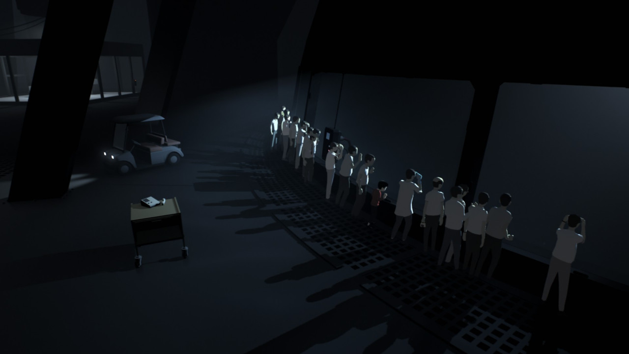
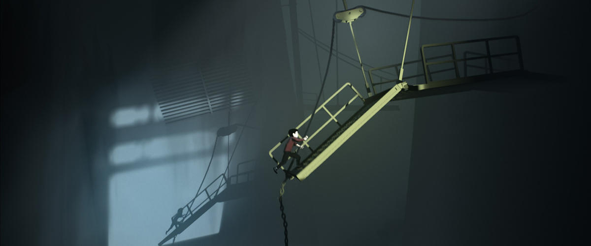
Later in the project, we began using cookies more and more. Doing so added some texture to our very simple scenes and sometimes helped us create the illusion of using more sophisticated shadowing techniques.
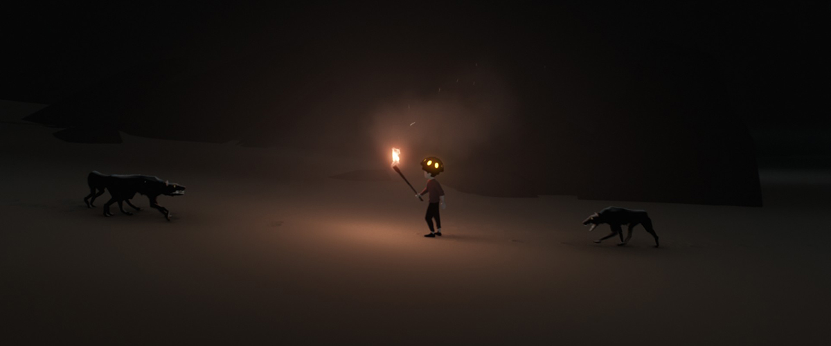
One of the interesting technical details of the torch effect is that the shadows emanating from the Boy’s feet are actually just simple shadow decals that track the position of the torch and rotate accordingly around the Boy’s feet. They even scale up and down depending on how high the torch is off the ground. We couldn’t use standard shadows here because casting from a point light would have been much too expensive.
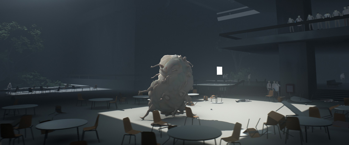
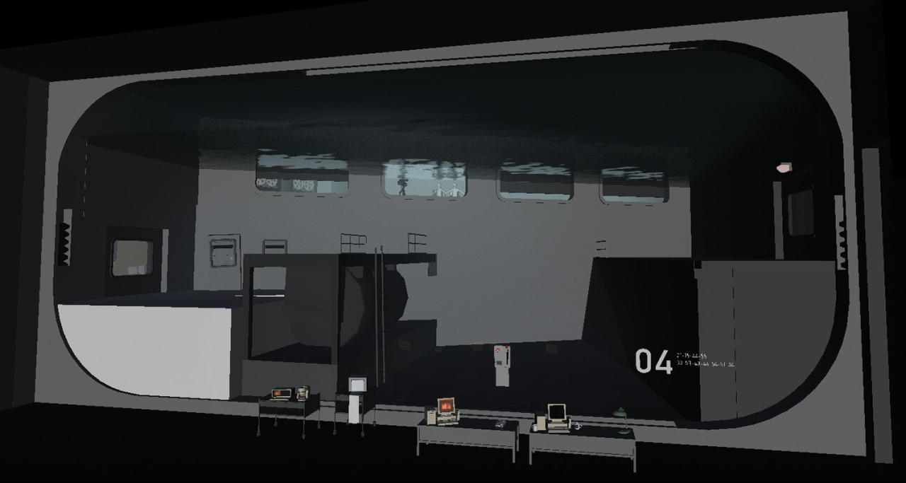
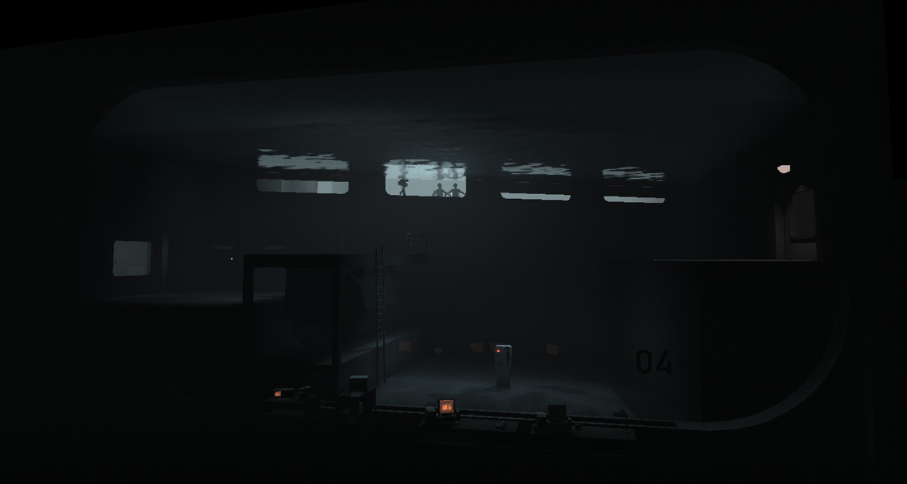
Above you can see how a room looks (in Unity) before/after it is lit and vfx are added.
I should say that as an artist, I loved setting up lighting using this solution. Props to MikkelG, MikkelS and Tobias for their skill and boundless enthusiasm in providing us with the tools and ideas behind it.